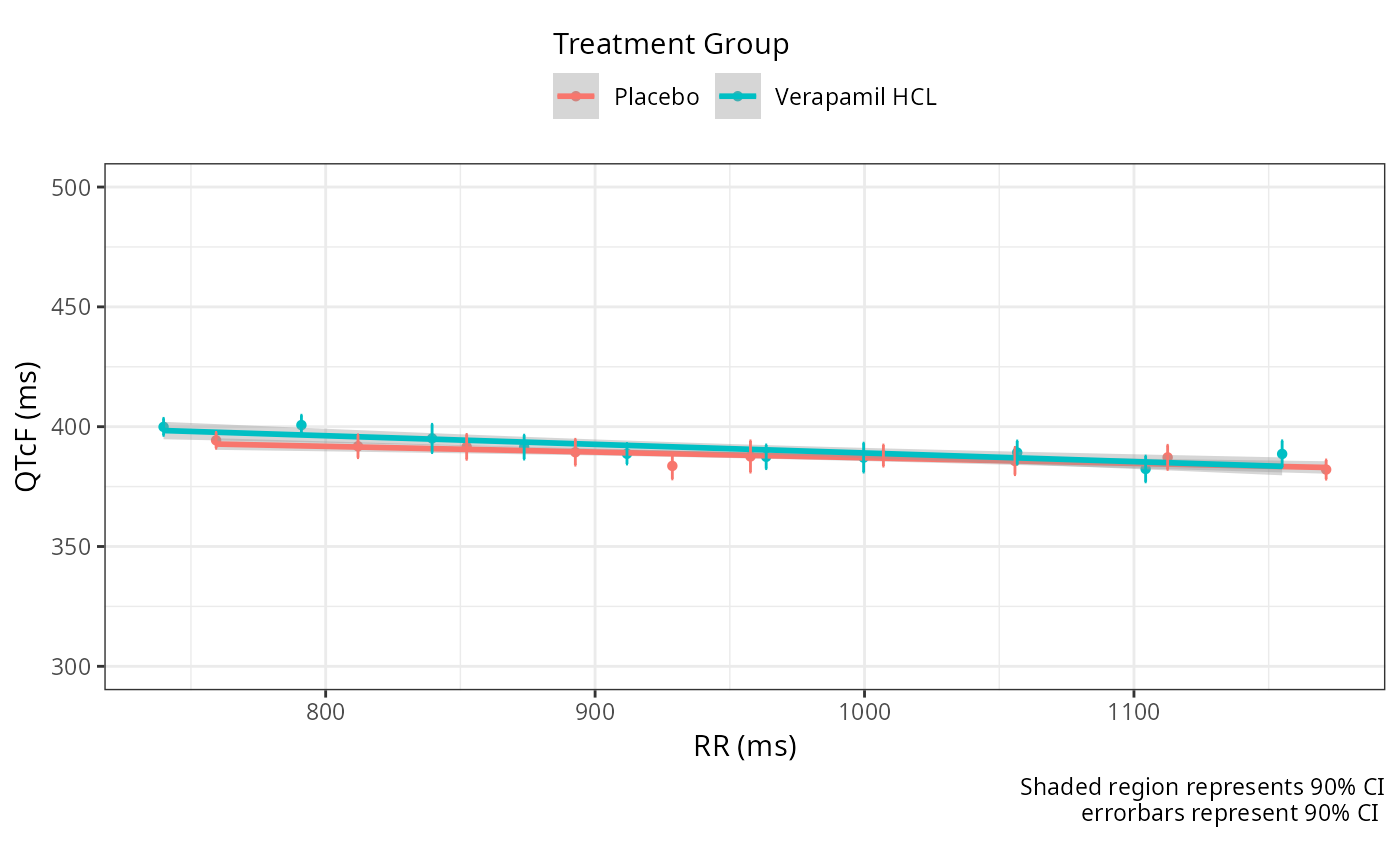
EDA Quantiles Plot
eda_quantiles_plot.RdPlots the observed decile-decile scatter plot of x-data vs y-data with linear regression.
Usage
eda_quantiles_plot(
  data,
  xdata_col,
  ydata_col,
  trt_col = NULL,
  plot_observations = FALSE,
  conf_int = 0.9,
  error_bars = "CI",
  style = list()
)
Arguments
- data
A data frame containing C-QT analysis dataset
- xdata_col
An unquoted column name for x data
- ydata_col
An unquoted column name for y data
- trt_col
An unquoted column name for treatment column to stratify the data by
- plot_observations
Logical, whether to include raw individual data points as background (default: FALSE)
- conf_int
Numeric confidence interval level (default: 0.9)
- error_bars
A string for setting which errorbars are shown, CI, SE, SD
- style
A named list of arguments passed to style_plot()
Examples
data_proc <- preprocess(cqtkit_data_verapamil)

eda_quantiles_plot(
  data_proc,
  RR,
  QTCF,
  trt_col = TRTG,
 style = set_style(
  legend = "Treatment Group",
  ylims = c(300, 500),
  xlabel = "RR (ms)",
  ylabel = "QTcF (ms)",
  legend.position = "top"
 )
)