Visual checks for the output of tuneLearn()
check.learn.RdProvides some visual plots showing how the calibration criterion and the effective degrees of freedom of each smooth component vary with the learning rate.
Usage
# S3 method for class 'learn'
check(obj, sel = 1:2, ...)Details
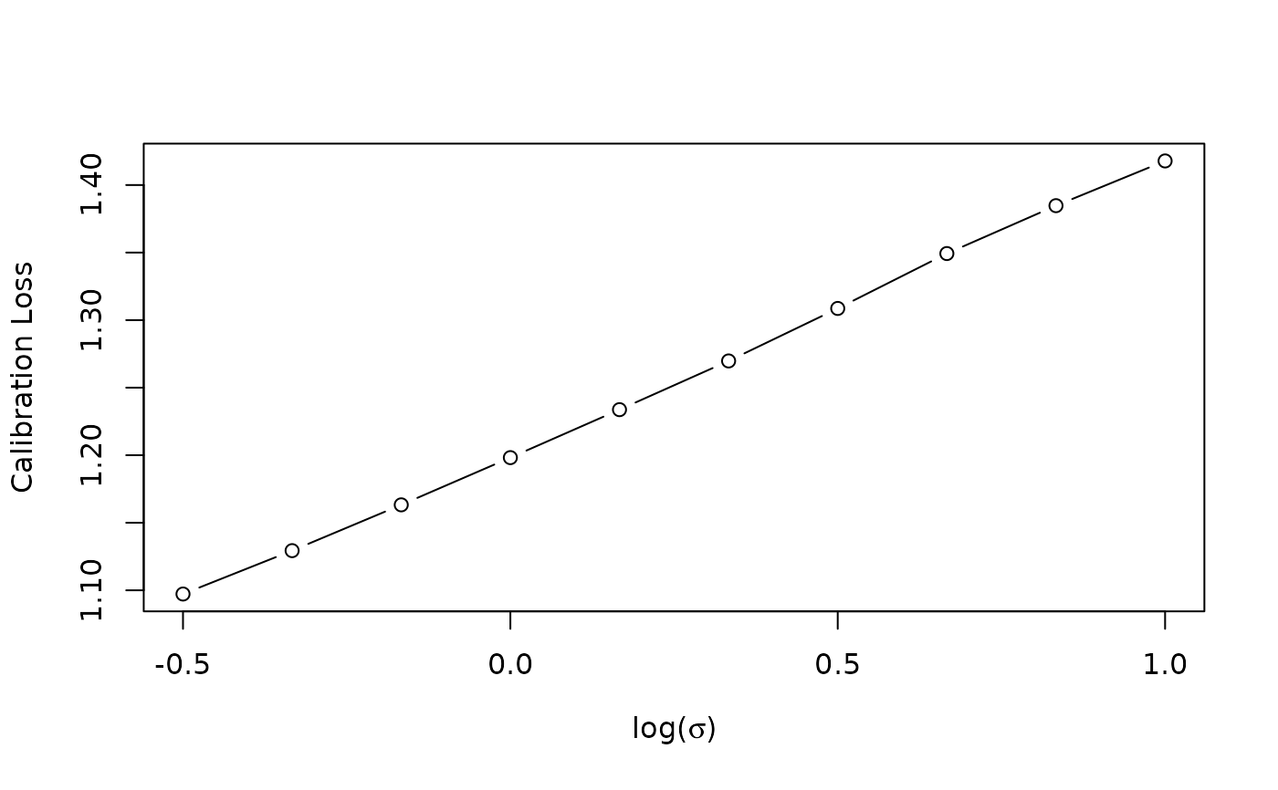
The first plot shows how the calibrations loss, which we are trying to minimize, varies with the
log learning rate. This function should look quite smooth, if it doesn't then try to increase
err or control$K (the number of bootstrap samples) in the original call to
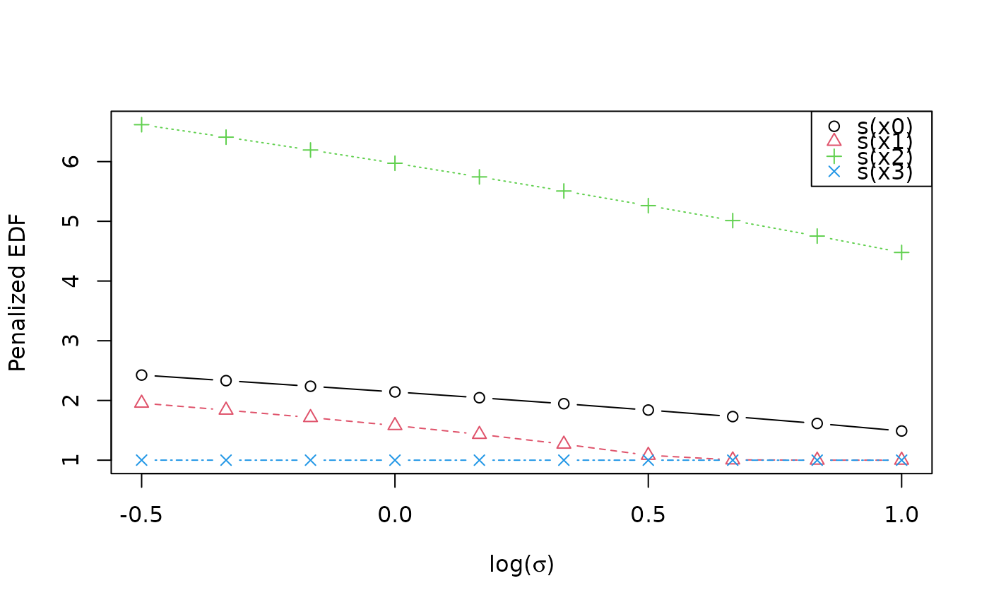
tuneLearn. The second plot shows how the effective degrees of freedom of each smooth term
vary with log(sigma). Generally as log(sigma) increases the complexity of the fit decreases, hence
the slope is negative.
References
Fasiolo, M., Wood, S.N., Zaffran, M., Nedellec, R. and Goude, Y., 2020. Fast calibrated additive quantile regression. Journal of the American Statistical Association (to appear). doi:10.1080/01621459.2020.1725521 .
Author
Matteo Fasiolo <[email protected]>.