scatter chart of returns vs risk for comparing multiple instruments
Source:R/chart.RiskReturnScatter.R
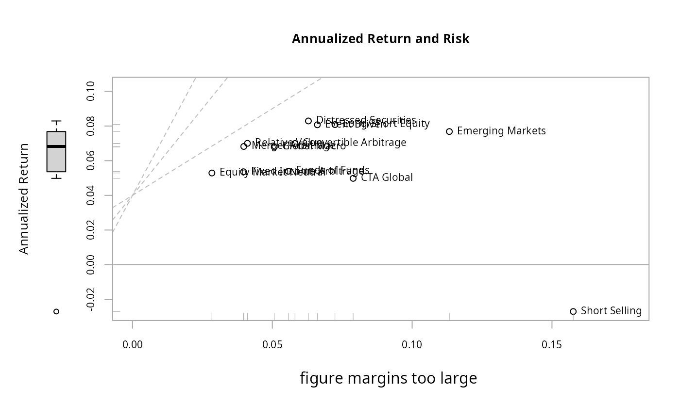
chart.RiskReturnScatter.RdA wrapper to create a scatter chart of annualized returns versus annualized risk (standard deviation) for comparing manager performance. Also puts a box plot into the margins to help identify the relative performance quartile.
Usage
chart.RiskReturnScatter(
  R,
  Rf = 0,
  main = "Annualized Return and Risk",
  add.names = TRUE,
  xlab = "Annualized Risk",
  ylab = "Annualized Return",
  method = "calc",
  geometric = TRUE,
  scale = NA,
  add.sharpe = c(1, 2, 3),
  add.boxplots = FALSE,
  colorset = 1,
  symbolset = 1,
  element.color = "darkgray",
  legend.loc = NULL,
  xlim = NULL,
  ylim = NULL,
  cex.legend = 1,
  cex.axis = 0.8,
  cex.main = 1,
  cex.lab = 1,
  na.fill = FALSE,
  ...
)
Arguments
- R
an xts, vector, matrix, data frame, timeSeries or zoo object of asset returns
- Rf
risk free rate, in same period as your returns
- main
set the chart title, same as in
plot- add.names
plots the row name with the data point. default TRUE. Can be removed by setting it to NULL
- xlab
set the x-axis label, as in
plot- ylab
set the y-axis label, as in
plot- method
if set as "calc", then the function will calculate values from the set of returns passed in. If method is set to "nocalc" then we assume that R is a column of return and a column of risk (e.g., annualized returns, annualized risk), in that order. Other method cases may be set for different risk/return calculations.
- geometric
utilize geometric chaining (TRUE) or simple/arithmetic chaining (FALSE) to aggregate returns, default TRUE
- scale
number of periods in a year (daily scale = 252, monthly scale = 12, quarterly scale = 4)
- add.sharpe
this draws a Sharpe ratio line that indicates Sharpe ratio levels of
c(1,2,3). Lines are drawn with a y-intercept of the risk free rate and the slope of the appropriate Sharpe ratio level. Lines should be removed where not appropriate (e.g., sharpe.ratio = NULL).- add.boxplots
TRUE/FALSE adds a boxplot summary of the data on the axis
- colorset
color palette to use, set by default to rational choices
- symbolset
from
pchinplot, submit a set of symbols to be used in the same order as the data sets submitted- element.color
provides the color for drawing chart elements, such as the box lines, axis lines, etc. Default is "darkgray"
- legend.loc
places a legend into one of nine locations on the chart: bottomright, bottom, bottomleft, left, topleft, top, topright, right, or center.
- xlim
set the x-axis limit, same as in
plot- ylim
set the y-axis limit, same as in
plot- cex.legend
The magnification to be used for sizing the legend relative to the current setting of 'cex'.
- cex.axis
The magnification to be used for axis annotation relative to the current setting of 'cex', same as in
plot.- cex.main
The magnification to be used for sizing the title relative to the current setting of 'cex'.
- cex.lab
The magnification to be used for x and y labels relative to the current setting of 'cex'.
- na.fill
optional numeric value to replace NAs, e.g. 0.
- ...
any other passthru parameters to
plot
Examples
data(edhec)
chart.RiskReturnScatter(edhec, Rf = .04 / 12)
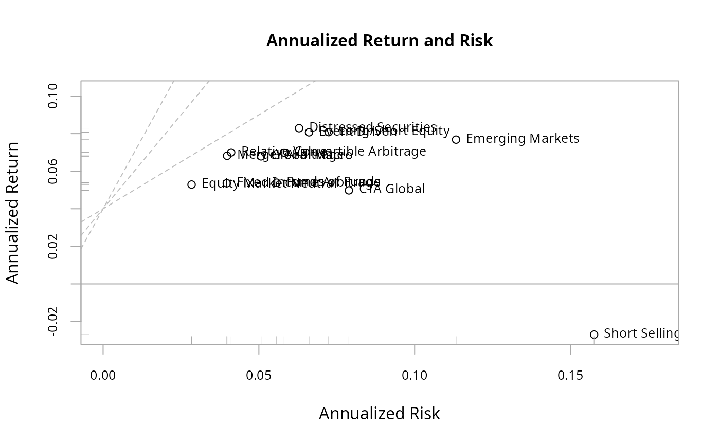 chart.RiskReturnScatter(edhec, Rf = .04 / 12, add.boxplots = TRUE)