Creates a time series chart with some extensions.
Source:R/chart.TimeSeries.R, R/chart.TimeSeries.base.R, R/chart.TimeSeries.builtin.R, and 5 more
chart.TimeSeries.RdDraws a line chart and labels the x-axis with the appropriate dates. This
is really a "primitive", since it extends the base plot and
standardizes the elements of a chart. Adds attributes for shading areas of
the timeline or aligning vertical lines along the timeline. This function is
intended to be used inside other charting functions.
Usage
chart.TimeSeries(
  R,
  ...,
  auto.grid = TRUE,
  xaxis = TRUE,
  yaxis = TRUE,
  yaxis.right = FALSE,
  type = "l",
  lty = 1,
  lwd = 1,
  las = par("las"),
  main = "",
  ylab = "",
  xlab = "",
  date.format.in = "%Y-%m-%d",
  date.format = NULL,
  xlim = NULL,
  ylim = NULL,
  element.color = "darkgray",
  event.lines = NULL,
  event.labels = NULL,
  period.areas = NULL,
  event.color = "darkgray",
  period.color = "aliceblue",
  colorset = (1:12),
  pch = (1:12),
  legend.loc = NULL,
  ylog = FALSE,
  cex.axis = 0.8,
  cex.legend = 0.8,
  cex.lab = 1,
  cex.labels = 0.8,
  cex.main = 1,
  major.ticks = "auto",
  minor.ticks = TRUE,
  grid.color = "lightgray",
  grid.lty = "dotted",
  xaxis.labels = NULL,
  plot.engine = "default",
  yaxis.pct = FALSE
)

chart.TimeSeries.base(
  R,
  auto.grid,
  xaxis,
  yaxis,
  yaxis.right,
  type,
  lty,
  lwd,
  las,
  main,
  ylab,
  xlab,
  date.format.in,
  date.format,
  xlim,
  ylim,
  element.color,
  event.lines,
  event.labels,
  period.areas,
  event.color,
  period.color,
  colorset,
  pch,
  legend.loc,
  ylog,
  cex.axis,
  cex.legend,
  cex.lab,
  cex.labels,
  cex.main,
  major.ticks,
  minor.ticks,
  grid.color,
  grid.lty,
  xaxis.labels,
  plot.engine,
  yaxis.pct,
  ...
)

chart.TimeSeries.builtin(
  R,
  auto.grid,
  xaxis,
  yaxis,
  yaxis.right,
  type,
  lty,
  lwd,
  las,
  main,
  ylab,
  xlab,
  date.format.in,
  date.format,
  xlim,
  ylim,
  element.color,
  event.lines,
  event.labels,
  period.areas,
  event.color,
  period.color,
  colorset,
  pch,
  legend.loc,
  ylog,
  cex.axis,
  cex.legend,
  cex.lab,
  cex.labels,
  cex.main,
  major.ticks,
  minor.ticks,
  grid.color,
  grid.lty,
  xaxis.labels,
  yaxis.pct,
  ...
)

chart.TimeSeries.dygraph(R, type = "l", ylog = FALSE)

chart.TimeSeries.ggplot2(
  R,
  auto.grid,
  xaxis,
  yaxis,
  yaxis.right,
  type,
  lty,
  lwd,
  las,
  main,
  ylab,
  xlab,
  date.format.in,
  date.format,
  xlim,
  ylim,
  element.color,
  event.lines,
  event.labels,
  period.areas,
  event.color,
  period.color,
  colorset,
  pch,
  legend.loc,
  ylog,
  cex.axis,
  cex.legend,
  cex.lab,
  cex.labels,
  cex.main,
  major.ticks,
  minor.ticks,
  grid.color,
  grid.lty,
  xaxis.labels,
  plot.engine,
  yaxis.pct
)

chart.TimeSeries.googlevis(R, xlab, ylab, main, type = "l", ylog = FALSE)

chart.TimeSeries.plotly(R, main, type = "l", ylog = FALSE, ...)

charts.TimeSeries(R, space = 0, main = "Returns", ...)
Arguments
- R
an xts, vector, matrix, data frame, timeSeries or zoo object of asset returns
- ...
any other passthru parameters
- auto.grid
if true, draws a grid aligned with the points on the x and y axes
- xaxis
if true, draws the x axis
- yaxis
if true, draws the y axis
- yaxis.right
if true, draws the y axis on the right-hand side of the plot
- type
set the chart type, same as in
plot- lty
set the line type, same as in
plot- lwd
set the line width, same as in
plot- las
set the axis label rotation, same as in
plot- main
set the chart title, same as in
plot- ylab
set the y-axis label, same as in
plot- xlab
set the x-axis label, same as in
plot- date.format.in
allows specification of other date formats in the data object, defaults to "%Y-%m-%d"
- date.format
re-format the dates for the xaxis; the default is "%m/%y"
- xlim
set the x-axis limit, same as in
plot- ylim
set the y-axis limit, same as in
plot- element.color
provides the color for drawing chart elements, such as the box lines, axis lines, etc. Default is "darkgray"
- event.lines
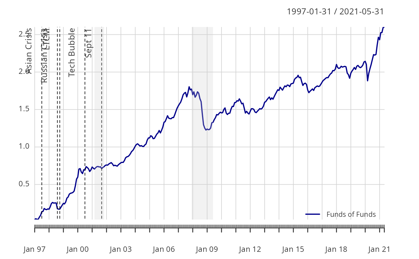
if not null, vertical lines will be drawn to indicate that an event happened during that time period.
event.linesshould be a list of dates (e.g.,c("09/03","05/06"))formatted the same as date.format. This function matches the re-formatted row names (dates) with the events.list, so to get a match the formatting needs to be correct.- event.labels
if not null and event.lines is not null, this will apply a list of text labels (e.g.,
c("This Event", "That Event")to the vertical lines drawn. See the example below.- period.areas
these are shaded areas described by start and end dates in a vector of xts date rangees, e.g.,
c("1926-10::1927-11","1929-08::1933-03")See the examples below.- event.color
draws the event described in
event.labelsin the color specified- period.color
draws the shaded region described by
period.areasin the color specified- colorset
color palette to use, set by default to rational choices
- pch
symbols to use, see also
plot- legend.loc
places a legend into one of nine locations on the chart: bottomright, bottom, bottomleft, left, topleft, top, topright, right, or center.
- ylog
TRUE/FALSE set the y-axis to logarithmic scale, similar to
plot, default FALSE- cex.axis
The magnification to be used for axis annotation relative to the current setting of 'cex', same as in
plot.- cex.legend
(deprecated) The magnification to be used for sizing the legend relative to the current setting of 'cex'.
- cex.lab
The magnification to be used for x- and y-axis labels relative to the current setting of 'cex'.
- cex.labels
The magnification to be used for event line labels relative to the current setting of 'cex'.
- cex.main
The magnification to be used for the chart title relative to the current setting of 'cex'.
- major.ticks
Should major tickmarks be drawn and labeled, default 'auto'
- minor.ticks
Should minor tickmarks be drawn, default TRUE
- grid.color
sets the color for the reference grid
- grid.lty
defines the line type for the grid
- xaxis.labels
Allows for non-date labeling of date axes, default is NULL
- plot.engine
choose the plot engine you wish to use: ggplot2, plotly,dygraph,googlevis and default
- yaxis.pct
if TRUE, scales the y axis labels by 100
- space
(deprecated) default 0
Examples
# These are start and end dates, formatted as xts ranges.
## https://www.nber.org-cycles.html
cycles.dates <- c(
"1857-06/1858-12",
"1860-10/1861-06",
"1865-04/1867-12",
"1869-06/1870-12",
"1873-10/1879-03",
"1882-03/1885-05",
"1887-03/1888-04",
"1890-07/1891-05",
"1893-01/1894-06",
"1895-12/1897-06",
"1899-06/1900-12",
"1902-09/1904-08",
"1907-05/1908-06",
"1910-01/1912-01",
"1913-01/1914-12",
"1918-08/1919-03",
"1920-01/1921-07",
"1923-05/1924-07",
"1926-10/1927-11",
"1929-08/1933-03",
"1937-05/1938-06",
"1945-02/1945-10",
"1948-11/1949-10",
"1953-07/1954-05",
"1957-08/1958-04",
"1960-04/1961-02",
"1969-12/1970-11",
"1973-11/1975-03",
"1980-01/1980-07",
"1981-07/1982-11",
"1990-07/1991-03",
"2001-03/2001-11",
"2007-12/2009-06"
)
# Event lists - FOR BEST RESULTS, KEEP THESE DATES IN ORDER
risk.dates <- c(
"Oct 87",
"Feb 94",
"Jul 97",
"Aug 98",
"Oct 98",
"Jul 00",
"Sep 01"
)
risk.labels <- c(
"Black Monday",
"Bond Crash",
"Asian Crisis",
"Russian Crisis",
"LTCM",
"Tech Bubble",
"Sept 11"
)
data(edhec)
R <- edhec[, "Funds of Funds", drop = FALSE]
Return.cumulative <- cumprod(1 + R) - 1
chart.TimeSeries(Return.cumulative)
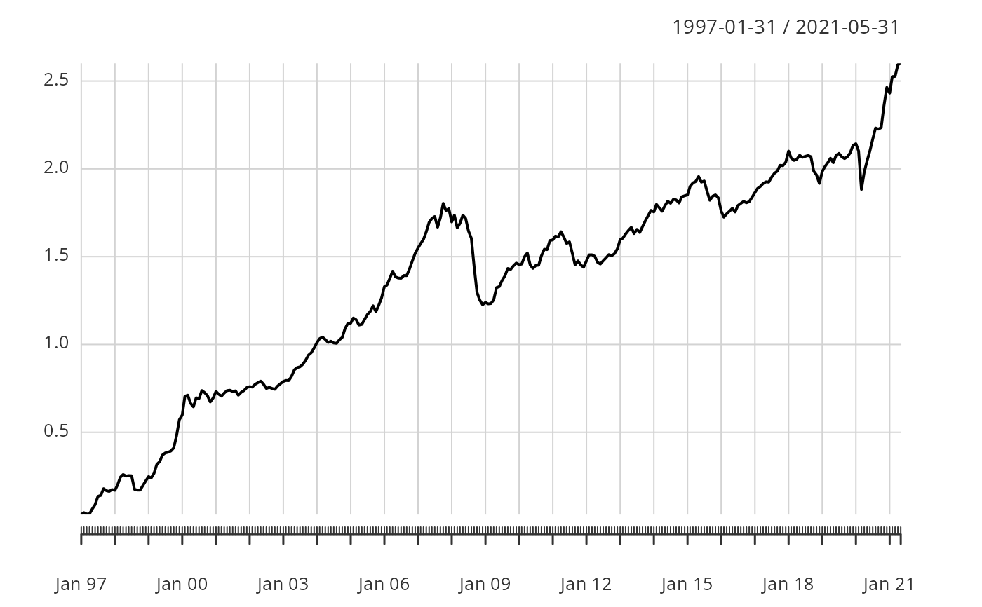 chart.TimeSeries(Return.cumulative,
colorset = "darkblue",
legend.loc = "bottomright",
period.areas = cycles.dates,
period.color = rgb(204 / 255, 204 / 255, 204 / 255, alpha = 0.25),
event.lines = risk.dates,
event.labels = risk.labels,
event.color = "red", lwd = 2
)
chart.TimeSeries(Return.cumulative,
colorset = "darkblue",
legend.loc = "bottomright",
period.areas = cycles.dates,
period.color = rgb(204 / 255, 204 / 255, 204 / 255, alpha = 0.25),
event.lines = risk.dates,
event.labels = risk.labels,
event.color = "red", lwd = 2
)