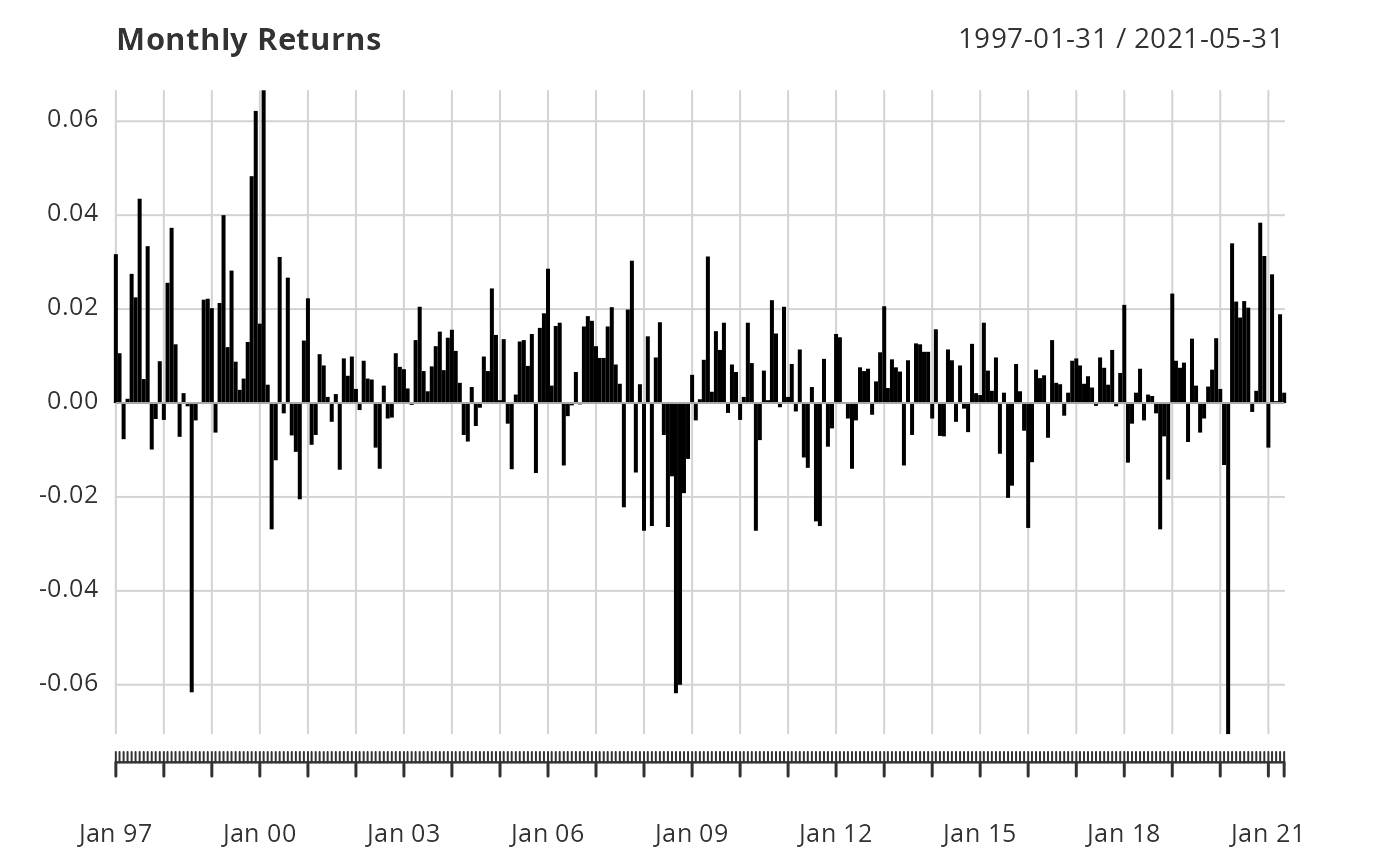
A wrapper to create a chart of periodic returns in a bar chart. This is a difficult enough graph to read that it doesn't get much use. Still, it is useful for viewing a single set of data.
Usage
chart.Bar(R, legend.loc = NULL, colorset = (1:12), ...)

charts.Bar(R, main = "Returns", cex.legend = 0.8, cex.main = 1, ...)
Arguments
- R
an xts, vector, matrix, data frame, timeSeries or zoo object of asset returns
- legend.loc
places a legend into one of nine locations on the chart: bottomright, bottom, bottomleft, left, topleft, top, topright, right, or center
- colorset
color palette to use, set by default to rational choices
- ...
any other passthru parameters, see
plot- main
sets the title text, such as in
chart.TimeSeries- cex.legend
(deprecated) sets the legend text size, such as in
chart.TimeSeries- cex.main
sets the title text size, such as in
chart.TimeSeries
Details
This is really a wrapper for chart.TimeSeries, so several other attributes can also be passed.
Creates a plot of time on the x-axis and vertical lines for each period to indicate value on the y-axis.
Examples
data(edhec)
chart.Bar(edhec[,"Funds of Funds"], main="Monthly Returns")