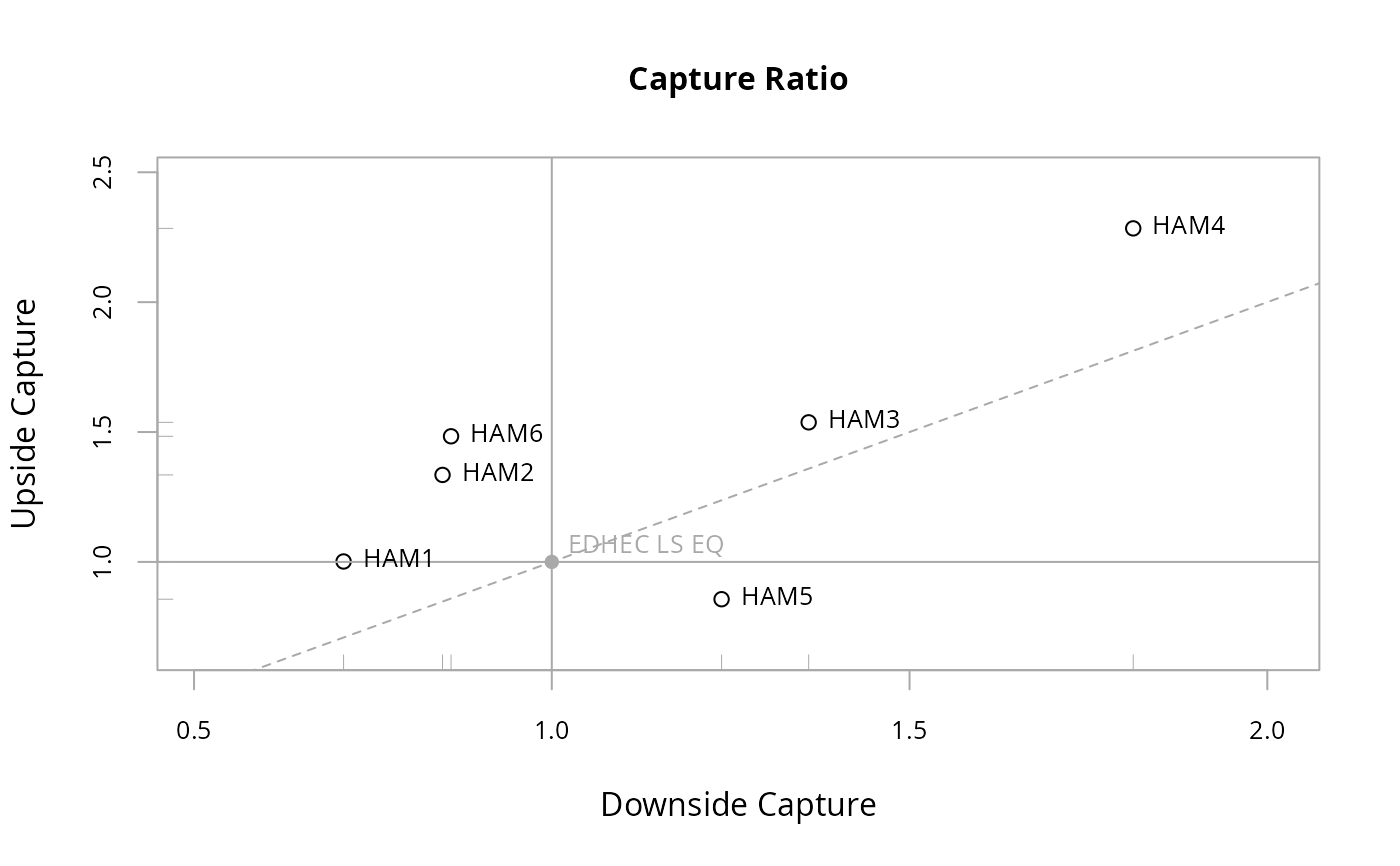
Scatter plot of Up Capture versus Down Capture against a benchmark
Usage
chart.CaptureRatios(
  Ra,
  Rb,
  main = "Capture Ratio",
  add.names = TRUE,
  xlab = "Downside Capture",
  ylab = "Upside Capture",
  colorset = 1,
  symbolset = 1,
  legend.loc = NULL,
  xlim = NULL,
  ylim = NULL,
  cex.legend = 1,
  cex.axis = 0.8,
  cex.main = 1,
  cex.lab = 1,
  element.color = "darkgray",
  benchmark.color = "darkgray",
  ...
)
Arguments
- Ra
Returns to test, e.g., the asset to be examined
- Rb
Returns of a benchmark to compare the asset with
- main
Set the chart title, same as in
plot- add.names
Plots the row name with the data point. Default TRUE. Can be removed by setting it to NULL
- xlab
Set the x-axis label, as in
plot- ylab
Set the y-axis label, as in
plot- colorset
Color palette to use, set by default to "black"
- symbolset
From
pchinplot. Submit a set of symbols to be used in the same order as the data sets submitted- legend.loc
Places a legend into one of nine locations on the chart: bottomright, bottom, bottomleft, left, topleft, top, topright, right, or center.
- xlim
set the x-axis limit, same as in
plot- ylim
set the y-axis limit, same as in
plot- cex.legend
The magnification to be used for sizing the legend relative to the current setting of 'cex'.
- cex.axis
The magnification to be used for axis annotation relative to the current setting of 'cex', same as in
plot.- cex.main
The magnification to be used for sizing the title relative to the current setting of 'cex'.
- cex.lab
The magnification to be used for x and y labels relative to the current setting of 'cex'.
- element.color
Specify the color of the box, axes, and other chart elements. Default is "darkgray"
- benchmark.color
Specify the color of the benchmark reference and crosshairs. Default is "darkgray"
- ...
Any other passthru parameters to
plot
Details
Scatter plot shows the coordinates of each set of returns' Up and Down Capture against a benchmark. The benchmark value is by definition plotted at (1,1) with solid crosshairs. A diagonal dashed line with slope equal to 1 divides the plot into two regions: above that line the UpCapture exceeds the DownCapture, and vice versa.
Examples
    data(managers)
    chart.CaptureRatios(managers[,1:6], managers[,7,drop=FALSE])