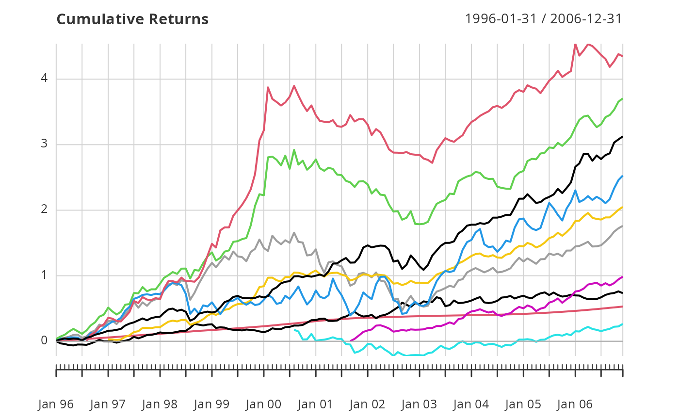
Chart that cumulates the periodic returns given and draws a line graph of the results as a "wealth index".
Usage
chart.CumReturns(
  R,
  wealth.index = FALSE,
  geometric = TRUE,
  legend.loc = NULL,
  colorset = (1:12),
  begin = c("first", "axis"),
  plot.engine = "default",
  ...
)
Arguments
- R
an xts, vector, matrix, data frame, timeSeries or zoo object of asset returns
- wealth.index
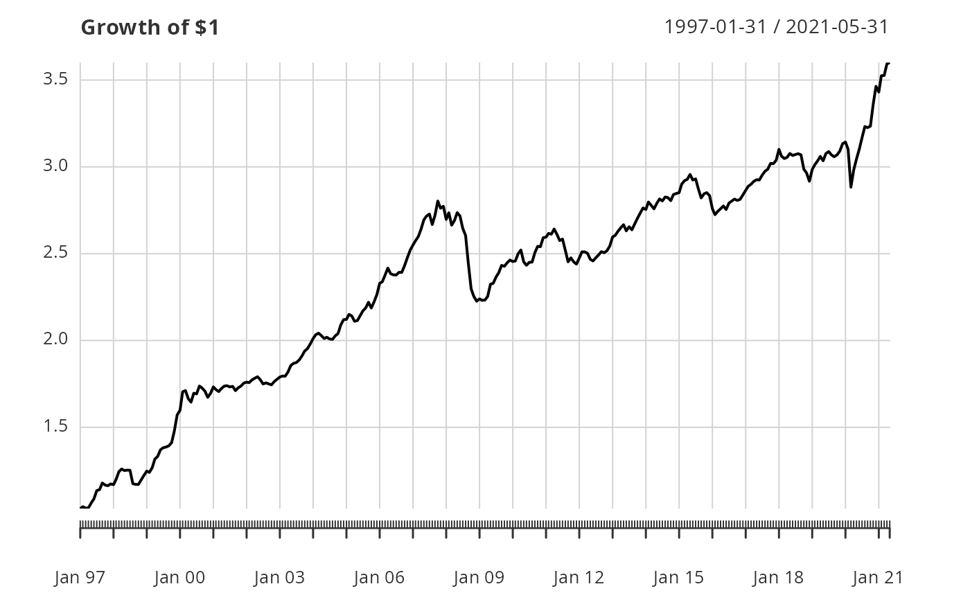
if
wealth.indexisTRUE, shows the "value of $1", starting the cumulation of returns at 1 rather than zero- geometric
utilize geometric chaining (TRUE) or simple/arithmetic chaining (FALSE) to aggregate returns, default TRUE
- legend.loc
places a legend into one of nine locations on the chart: bottomright, bottom, bottomleft, left, topleft, top, topright, right, or center.
- colorset
color palette to use, set by default to rational choices
- begin
Align shorter series to:
first - prior value of the first column given for the reference or longer series or,
axis - the initial value (1 or zero) of the axis.
- plot.engine
choose the plot engine you wish to use" ggplot2, plotly,dygraph,googlevis and default
- ...
any other passthru parameters
Examples
data(edhec)
chart.CumReturns(edhec[,"Funds of Funds"],main="Cumulative Returns")
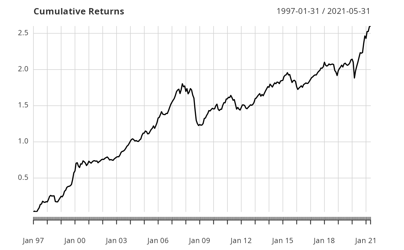 chart.CumReturns(edhec[,"Funds of Funds"],wealth.index=TRUE, main="Growth of $1")
 data(managers)
chart.CumReturns(managers,main="Cumulative Returns",begin="first")
data(managers)
chart.CumReturns(managers,main="Cumulative Returns",begin="first")
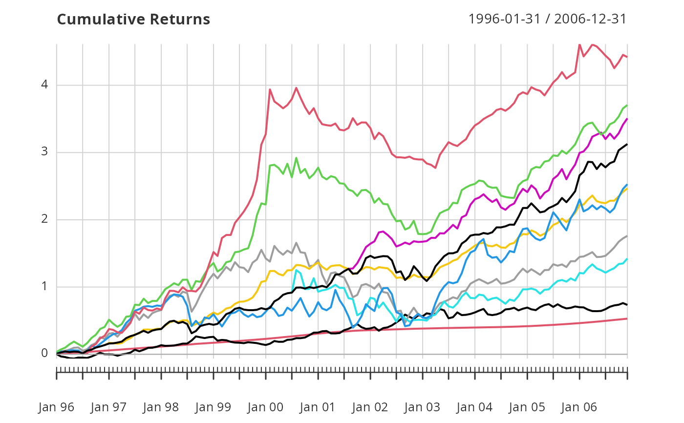 chart.CumReturns(managers,main="Cumulative Returns",begin="axis")