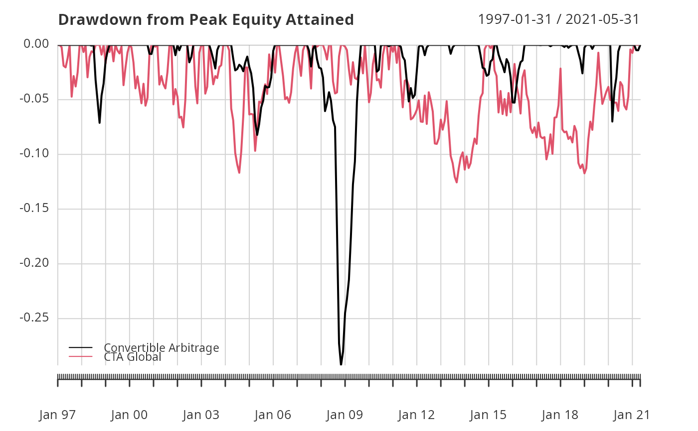
A time series chart demonstrating drawdowns from peak equity attained through time, calculated from periodic returns.
Usage
chart.Drawdown(
  R,
  geometric = TRUE,
  legend.loc = NULL,
  colorset = (1:12),
  plot.engine = "default",
  ...
)
Arguments
- R
an xts, vector, matrix, data frame, timeSeries or zoo object of asset returns
- geometric
utilize geometric chaining (TRUE) or simple/arithmetic chaining (FALSE) to aggregate returns, default TRUE
- legend.loc
places a legend into one of nine locations on the chart: bottomright, bottom, bottomleft, left, topleft, top, topright, right, or center.
- colorset
color palette to use, set by default to rational choices
- plot.engine
choose the plot engine you wish to use: ggplot2, plotly,dygraph,googlevis and default
- ...
any other passthru parameters
Details
Any time the cumulative returns dips below the maximum cumulative returns, it's a drawdown. Drawdowns are measured as a percentage of that maximum cumulative return, in effect, measured from peak equity.
References
Bacon, C. Practical Portfolio Performance Measurement and
Attribution. Wiley. 2004. p. 88