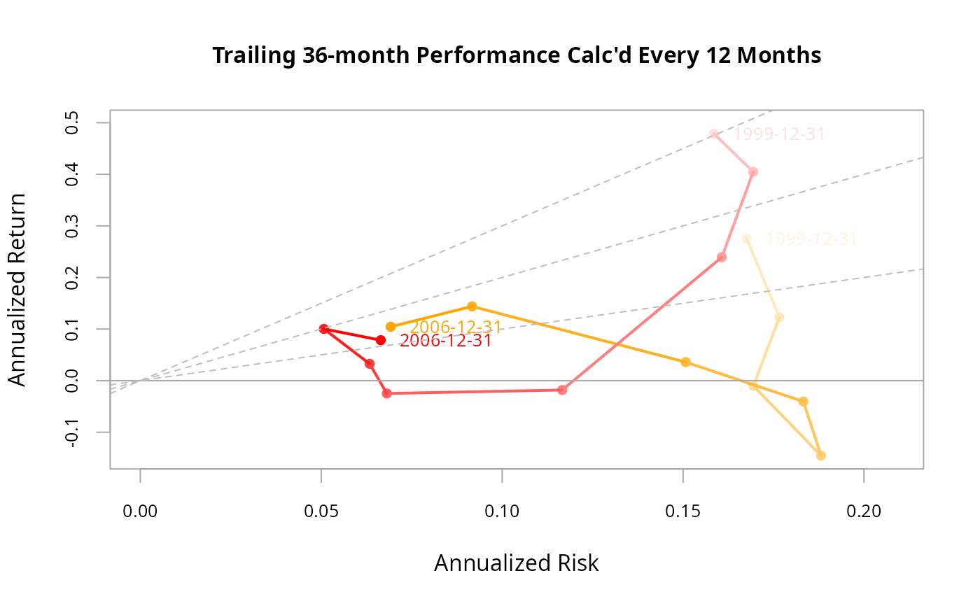
A chart that shows rolling calculations of annualized return and annualized standard deviation have proceeded through time. Lines and dots are darker for more recent time periods.
Usage
chart.SnailTrail(
  R,
  Rf = 0,
  main = "Annualized Return and Risk",
  add.names = c("all", "lastonly", "firstandlast", "none"),
  xlab = "Annualized Risk",
  ylab = "Annualized Return",
  add.sharpe = c(1, 2, 3),
  colorset = 1:12,
  symbolset = 16,
  legend.loc = NULL,
  xlim = NULL,
  ylim = NULL,
  width = 12,
  stepsize = 12,
  lty = 1,
  lwd = 2,
  cex.axis = 0.8,
  cex.main = 1,
  cex.lab = 1,
  cex.text = 0.8,
  cex.legend = 0.8,
  element.color = "darkgray",
  ...
)
Arguments
- R
an xts, vector, matrix, data frame, timeSeries or zoo object of asset returns
- Rf
risk free rate, in same period as your returns
- main
set the chart title, same as in
plot- add.names
plots the row name with the data point. default TRUE. Can be removed by setting it to NULL
- xlab
set the x-axis label, as in
plot- ylab
set the y-axis label, as in
plot- add.sharpe
this draws a Sharpe ratio line that indicates Sharpe ratio levels of
c(1,2,3). Lines are drawn with a y-intercept of the risk free rate and the slope of the appropriate Sharpe ratio level. Lines should be removed where not appropriate (e.g., sharpe.ratio = NULL).- colorset
color palette to use, set by default to rational choices
- symbolset
from
pchinplot, submit a set of symbols to be used in the same order as the data sets submitted- legend.loc
places a legend into one of nine locations on the chart: bottomright, bottom, bottomleft, left, topleft, top, topright, right, or center.
- xlim
set the x-axis limit, same as in
plot- ylim
set the y-axis limit, same as in
plot- width
number of periods to apply rolling calculations over, sometimes referred to as a 'window'
- stepsize
the frequency with which to make the rolling calculation
- lty
set the line type, same as in
plot- lwd
set the line width, same as in
plot- cex.axis
The magnification to be used for sizing the axis text relative to the current setting of 'cex', similar to
plot.- cex.main
The magnification to be used for sizing the main chart relative to the current setting of 'cex', as in
plot.- cex.lab
The magnification to be used for sizing the label relative to the current setting of 'cex', similar to
plot.- cex.text
The magnification to be used for sizing the text relative to the current setting of 'cex', similar to
plot.- cex.legend
The magnification to be used for sizing the legend relative to the current setting of 'cex'.
- element.color
provides the color for drawing chart elements, such as the box lines, axis lines, etc. Default is "darkgray"
- ...
any other passthru parameters